Seeing the Big Picture of Your OTT Business

Over the years our customer base at Brightcove Audience Insights has grown to include companies that operate in multiple countries, and/or run more than one service. This can be a lot of data to keep track of, especially when trying to compare performance across regions or services. While it is really important to be able to dig into the details of a specific region or service which our full Scorecard accounts provide for, it’s also valuable to see how they compare to one another without getting lost in too much information.

To make these comparisons easier, we recently released a new feature that allows our customers to select multiple accounts and see their primary KPIs together. This allows top-level administrators to do a few things:

  1. They can set up permissions so that Insights Scorecard users can see accounts for services they work on: e.g. Acme Streaming – Germany, or Acme Sports
  2. They can set up permissions that allow comparison of any combination of accounts. For example, they could grant permission for some users to see Acme Sports across multiple regions, but not grant permissions to see any Acme Streaming accounts. This is great for users who need to see results for a service across multiple regions, or multiple services in a region, etc. They can also provide an all-access view of all accounts across services/regions. This is great for executives and those in roles that span all services.

Choosing accounts to compare is easy. Next to the account selection control, we added a “compare accounts” control. (Fig. 1)

compare accounts

Fig. 1 – Compare Accounts link in Insights Scorecard header.

When this is selected, users can then select the accounts they want to compare from the list that they have permissions to view. (Fig. 2)

compare accounts list

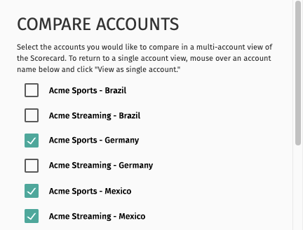
Fig. 2 – Select the sub-accounts you would like to compare.

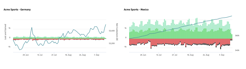
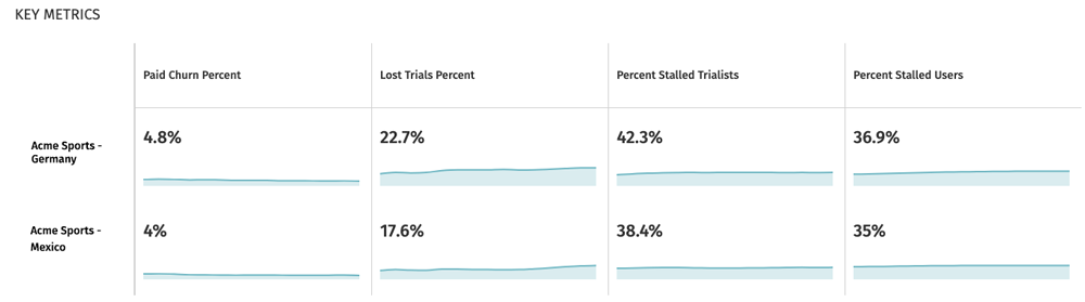
Once the accounts are selected, Insights Scorecard will re-render in comparison-mode.

Accounts being compared

Fig. 3 – Accounts being compared are indicated in the account selection control.

  1. First, it’s easy to tell that you are in this mode by looking at the account selection control. We display the number of accounts you are comparing and a list of the account names. (Fig. 3)
  2. In this view, we limit the Insights we display down to a manageable number. We display a primary graph that combines metrics from each account. (Fig. 4)
    customer count primary graph

    Fig. 4 – Customer Count primary graph comparing multiple accounts with accompanying legend.

  3. Next, we present separate, more detailed primary graphs for side by side comparison of accounts. (Fig. 5)
    detailed primary graphs

    Fig. 5 – More detailed primary graph for each service being compared.

  4. And finally, we show a table of key metrics for quick comparison.
    table of key metrics

    Fig. 6 – Easily compare performance across regions with key metrics.

The ability to easily compare performance across regions or lines of business is becoming increasingly important as brands scale up and look for opportunities and risks that should be addressed. Big deltas in conversion rates, churn, and other key metrics might point out approaches that need to be regionalized, or conversely, opportunities to borrow concepts that are working well in one line of business and apply them to others.

If your company operates more than one OTT service and/or operates in multiple regions, this product update is one worth learning more about.