Introducing OTT Benchmarks
It’s a question on the minds of most everyone, but it’s especially interesting when building a business in a rapidly evolving space, like OTT video. Knowing whether your key metrics are close to those of your peers and more importantly where they diverge, could provide powerful guidance in terms of how to optimize your effort and spending. Historically, these insights have been difficult to gain, with occasional nuggets inferred from analyst reports or informal conversations at industry events.
Metrics that matter
Now that we have reached sufficient scale in terms of the number of customers with large enough audience sizes, we can offer this kind of view. We’re excited to announce that OTT benchmarks are available across a variety of key metrics within the Audience Insights Dashboard. With this enhancement, our customers can not only see their business through many different internal lenses but look through an external lens as well, to see how they stack up and where it makes sense to focus resources. This is important because it provides really valuable context for business performance and ties it to actions you can take. For example, if a company is at the positive end of the standard deviation for a given key metric, additional spending in service of improving it might have diminishing returns. Whereas investing in an area where the business is significantly under-performing vis-a-vis the peer benchmark is probably money well spent.
Use Case
Below (Fig. 1) is an example of a Benchmark that we provide in the Audience Insights Dashboard…
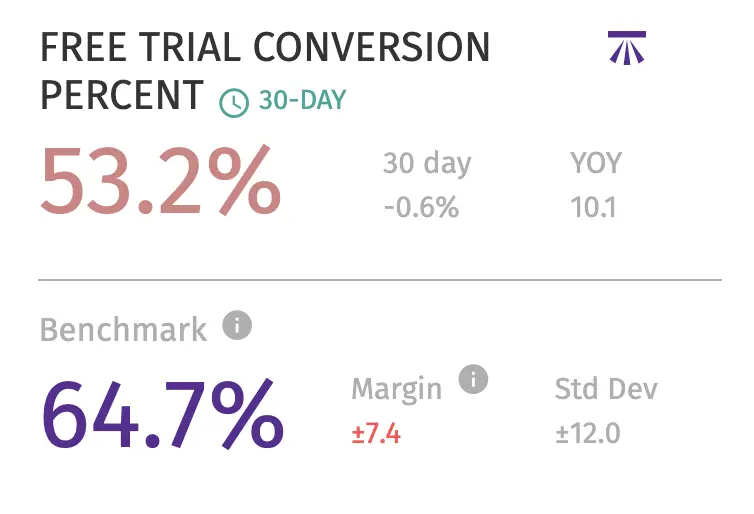
Fig. 1
It depicts a scenario where a fictional customer is underperforming with respect to free trial conversion (they do not fall within the 90% confidence interval). This is a great place to focus energy. In this case, some easy actions you can take, leveraging the Audience Insights Dashboard, include:
- Run Facebook lookalike campaigns using exports of your healthiest, happiest customers to better target potential subscribers
- Shorten your trial period and mark this with a milestone in the Audience Insights Dashboard to track the effectiveness of the change
- Focus marketing spend on the most productive trial sources
- Run engagement campaigns for stalled trialists
Suggestions like these will be available in tooltips for each benchmark so that there are always suggested actions to take, connected to the insight.
Benchmarks Available
Currently, we offer benchmarks for the following key metrics:
- Free Trial Conversion Percentage
- Monthly Subscriber Churn Percentage
- Lost Customers by Viewing Device & Sales Channel
- Lost Trials Percentage
- Percent Monthly Active Users
- Average # Unique Days Streamed for Active Users
- Average Hours Streamed/Week for Active Users
- Wau/Mau Ratio
What goes into a benchmark?
We use anonymized customer data to build our benchmarks. To ensure that the benchmarks are not susceptible to drift due to seasonality, small atypical audiences, or the differences in metrics of very new businesses, we set the following rules in terms of which customer accounts are used to build a benchmark and how benchmarks are created:
- Accounts must have had at least 10,000 audience members for at least one year
- Benchmarks are averaged over a rolling one year period
- There must be at least 1,000,000 audience members in aggregate for a benchmark to be presented
- We focused on benchmarks that would be universally useful, which are generally percentages, average time periods, etc. and avoided things like the number of video views, number of new trials, etc. which are hard to use in a relative context
This set of rules gives benchmarks better consistency, and while they will certainly change over time, they won’t whip-saw based on anomalies.
What’s with the benchmark symbol?
We borrowed this symbol from the old school surveying world:

© 2004, Jeremy Atherton
This symbol was used by surveyors to pinpoint an exact height above sea level, which is denoted by the horizontal line above the arrow. This provides the standard Benchmark from which all other heights are measured. We liked the connection to history and the real world, and the visual is pretty clear.